Design Strategy Studio,Est. 2011
ImagineCo
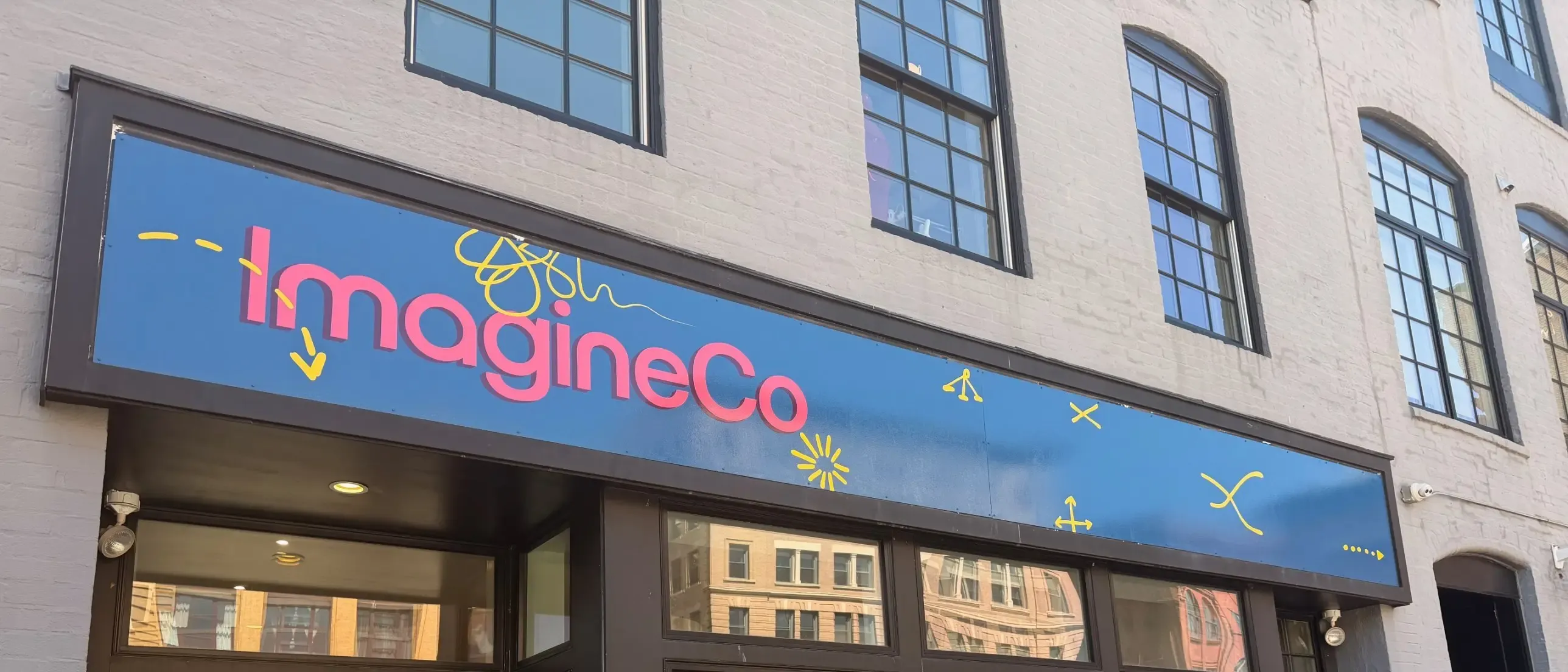
How does an identity stay coherent across a growing ecosystem of programs without making every one of them look the same?
ImagineCo is an imagination company. It works with leaders and organizations to envision and build new possibilities across business, culture, and society.
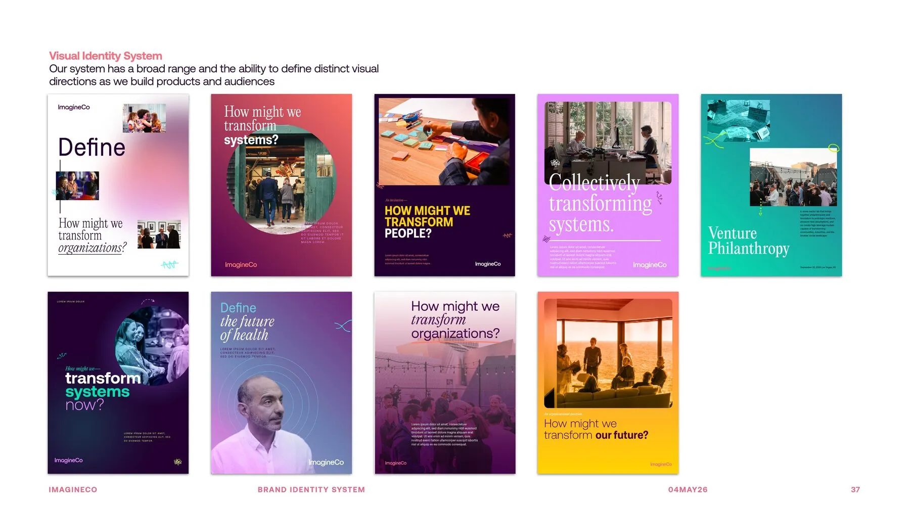
That work was growing into an ecosystem of programs and initiatives. An identity for that cannot be one lockup with rules around it. It has to stay recognizable while each program inside it goes somewhere different.
What we made
A visual identity built for range.
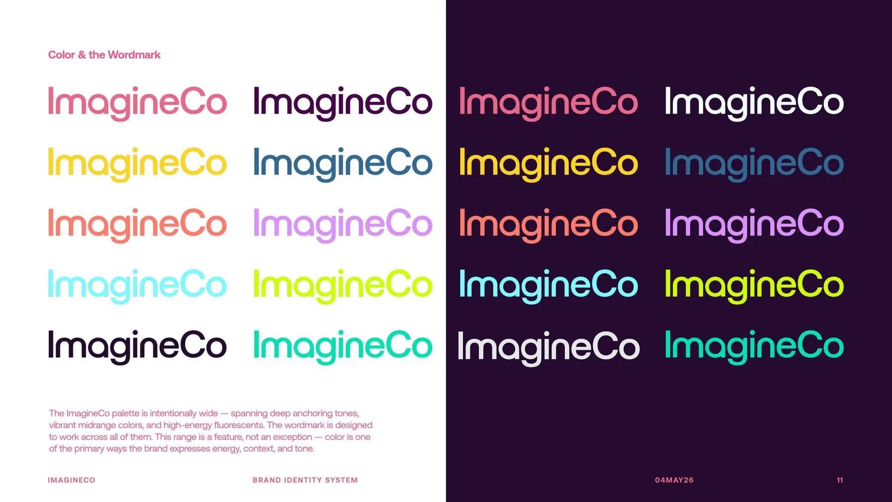
The palette is deliberately wide — deep anchoring tones, vibrant midrange colors, high-energy fluorescents. The wordmark is the fixed point, drawn to hold at every one of them. Color is how the brand changes register, not something the system has to be protected from.
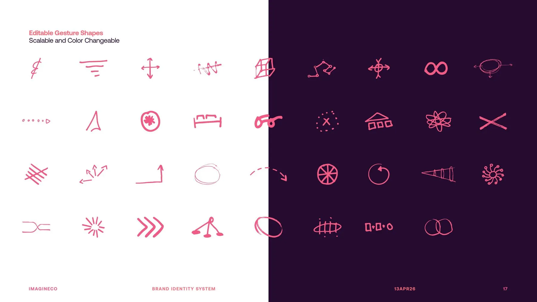
The gesture language came out of sketchbooks and working sessions. Underlines, arrows, circles, annotations — the marks people make while they are thinking. They are drawn rather than constructed, and they stay editable and scalable, so the system can show the thinking and not only the conclusion.
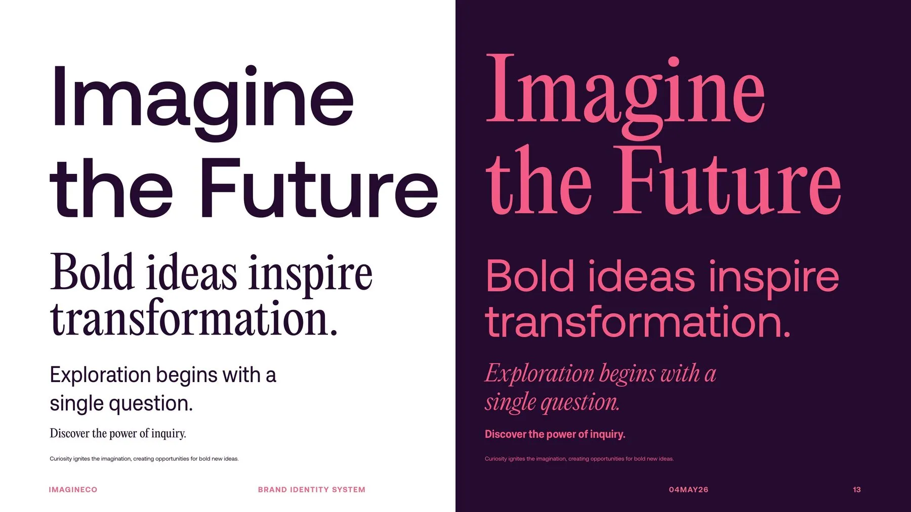
Two typographic voices rather than one. A page can be quiet or it can be loud, and both are in the system instead of one being an exception.
The result is a set of directions rather than a set of rules. Each program can take the palette, the gestures and the type somewhere specific to its own audience and still read as part of the same organization.